MIRROR Case Study
Responsive E-commerce clothing website
Company:
Mirror (clothing store)
Duration:
5 weeks
Role:
UX Researcher, UX/UI Designer

Project overview
Mirror is a very big clothing store chain for both kids and adults. A clothing store targeting a budget-minded audience who looked for low-cost clothing for any occasion. The quality is pretty good and the prices are rather low. They are very successful offline. They have over 400 stores around the world in 32 countries. However, they are very late in the game of a digital transformation. They decided to give people the opportunity to buy clothes online. Regarding the brand, Mirror has a very outdated logo that they are looking to re-do. They’re not planning on keeping anything of what they currently have.
goal
The goal is to create a responsive online store to increase sales and customers.
Solution
- Design a logo for the company that is modern and neutral enough to attract all types of people and styles.
- Design a responsive e-commerce website that is easy to use and allows customers to browse through all products and filter by size, color, style.
process

- Empathize

- Define

- Ideate

- Design

- Test
empathize
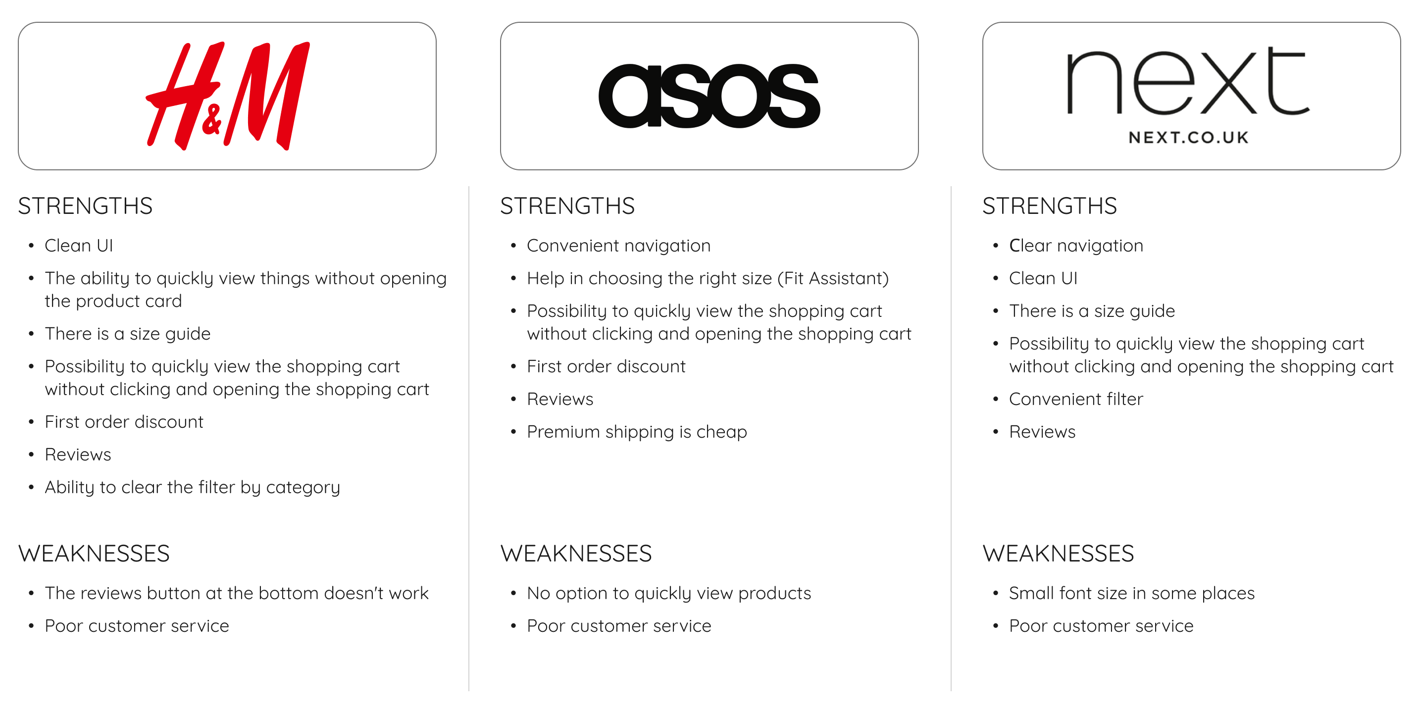
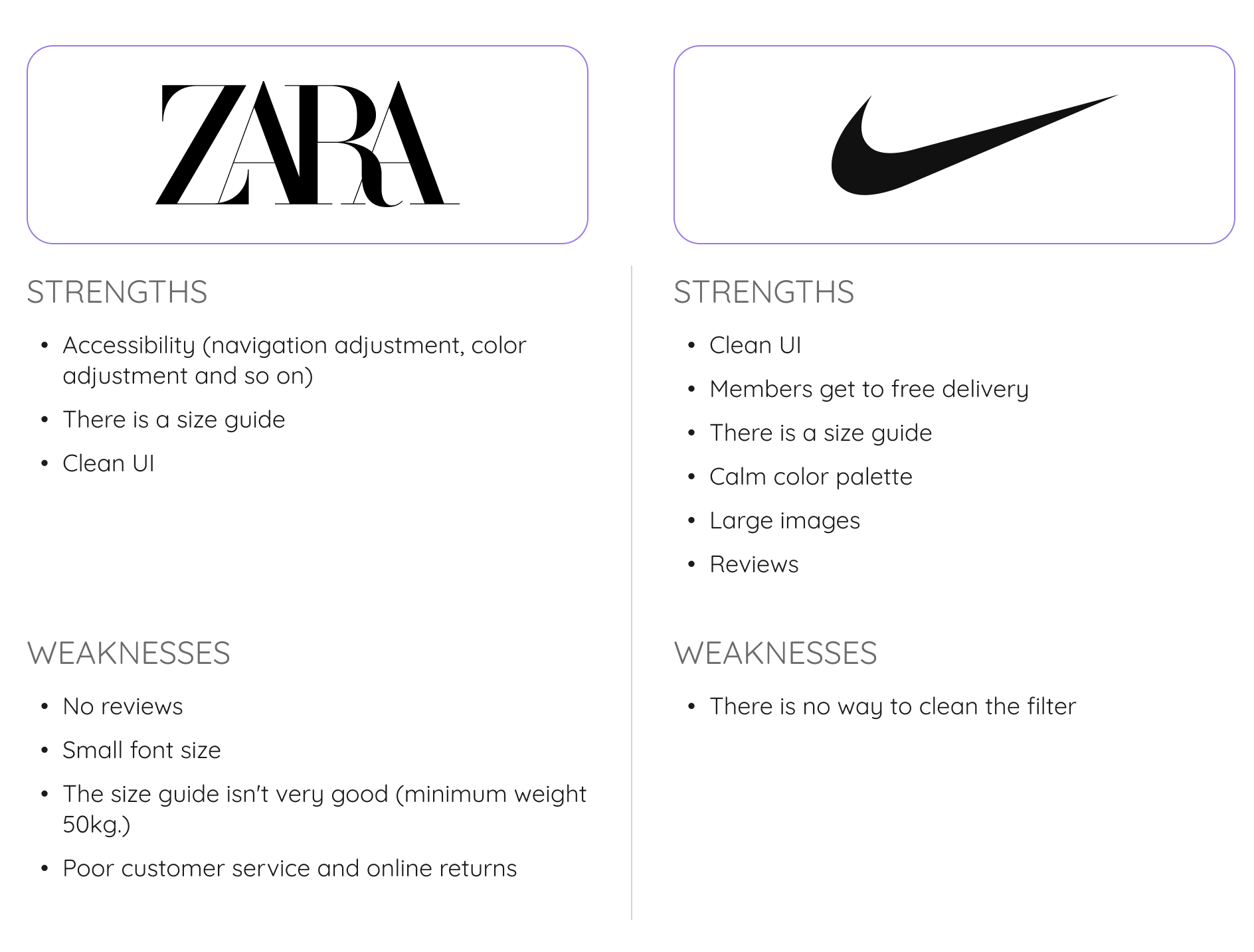
competitive analysis
I selected 5 companies for competitive analysis, 3 of them were direct competitors and 2 of them were indirect competitors. My goal was to compare their strengths and weaknesses and identify gaps and opportunities to make our site stand out.
Direct competitors
Indirect competitors
Summary
- Some online stores have the same features but are implemented differently.
- Each store has a filter, but not everyone has the ability to clear each category separately.
- Each store has the ability to add products to the cart without log in.
- The size guide is important because some people don't know their own size.
- Navigation should be simple and clear.
- Images should focus on the items, not the model.
- Large and contrasting CTA.
- The ability to have free shipping or a cheap annual shipping subscription is important.
- Use a readable font size.
- Show hot deals.
Interviews
The next step is to find out the preferences, thoughts, and feelings of users in order to collect data and draw generalised conclusions about the attitudes and behaviour of users. That's why I chose Qualitative Research - User Interview. I created a list of user interview questions and conducted it.
Number of participants – 3
Ages – 29–55 y.o.
Research objectives:
- Identify what motivates people to shop online.
- Understanding how they shop online.
- Understanding how they find certain products.
- Understanding what motivates people to add a product to the cart.
Summary
- The actual photo of the clothes is important
- Convenient filters, form of payment and the ordering process
- Products must have descriptive details
- The navigation is easy and clear
- Shipping is important
- Ability to use the website from different devices
- Ability to view reviews

define
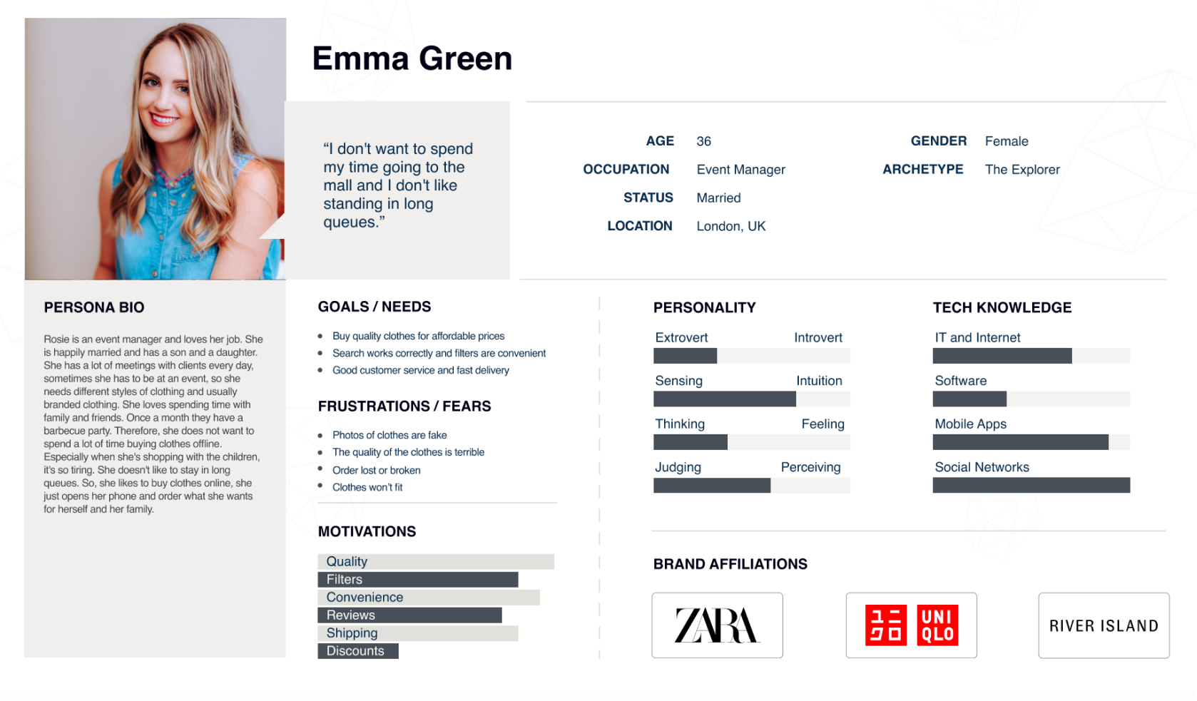
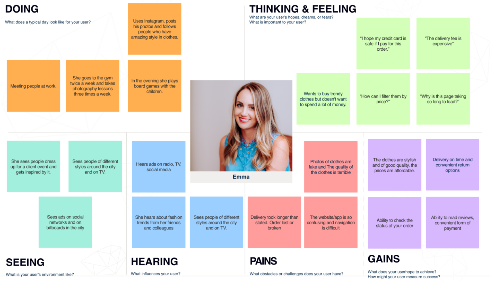
User persona
empathy map
storyboard
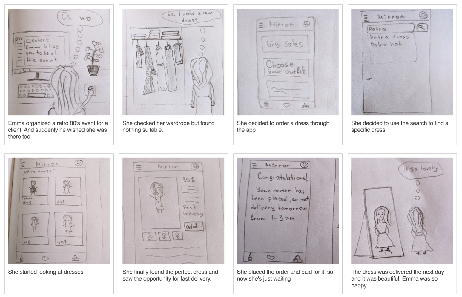
I'm using a storyboard to tell the story of why Emma decided to buy the dress. This helps me visually predict and explore user interactions with the product.
Ideate
Card sorting
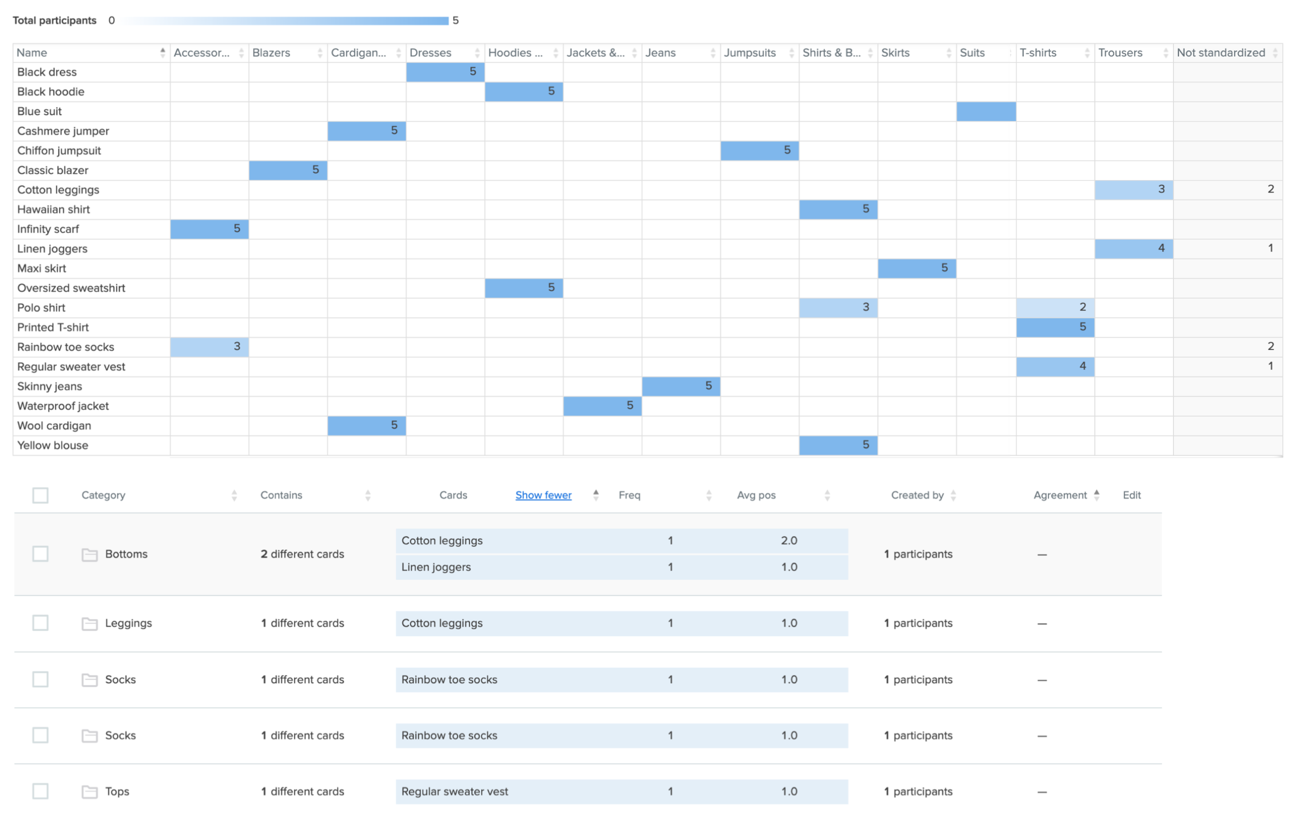
Card sorting is a way to understand and analyze the information architecture of a site. There were 20 items and 5 participants for card sorting. I chose the hybrid version of the card sort, which allows me to create a specific categories and also allows participants to create their own. I noticed 15/20 items were placed in the same categories by every participant and 5/20 items were placed in different categories.
2 out of 5 participants chose to place "Rainbow toe socks" in the "Socks" category instead of "Accessories". I think it would be nice to have a separate category for socks.
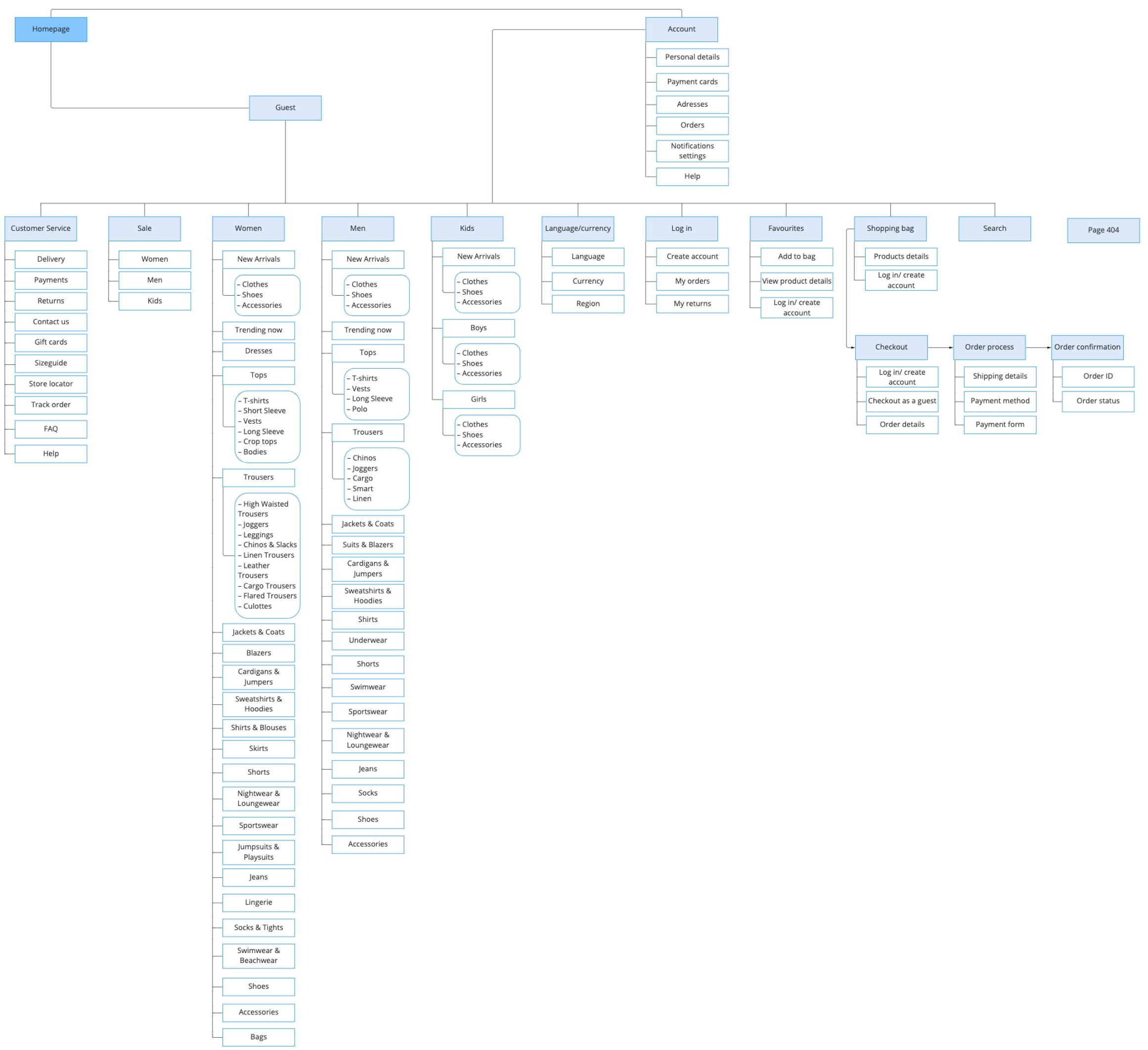
Sitemap
For the sitemap, I followed a simple algorithm that is easy to navigate. For most people, shopping for clothes online can be tricky and confusing. Our goal is to make the online shopping experience much easier, more accessible, and more enjoyable.
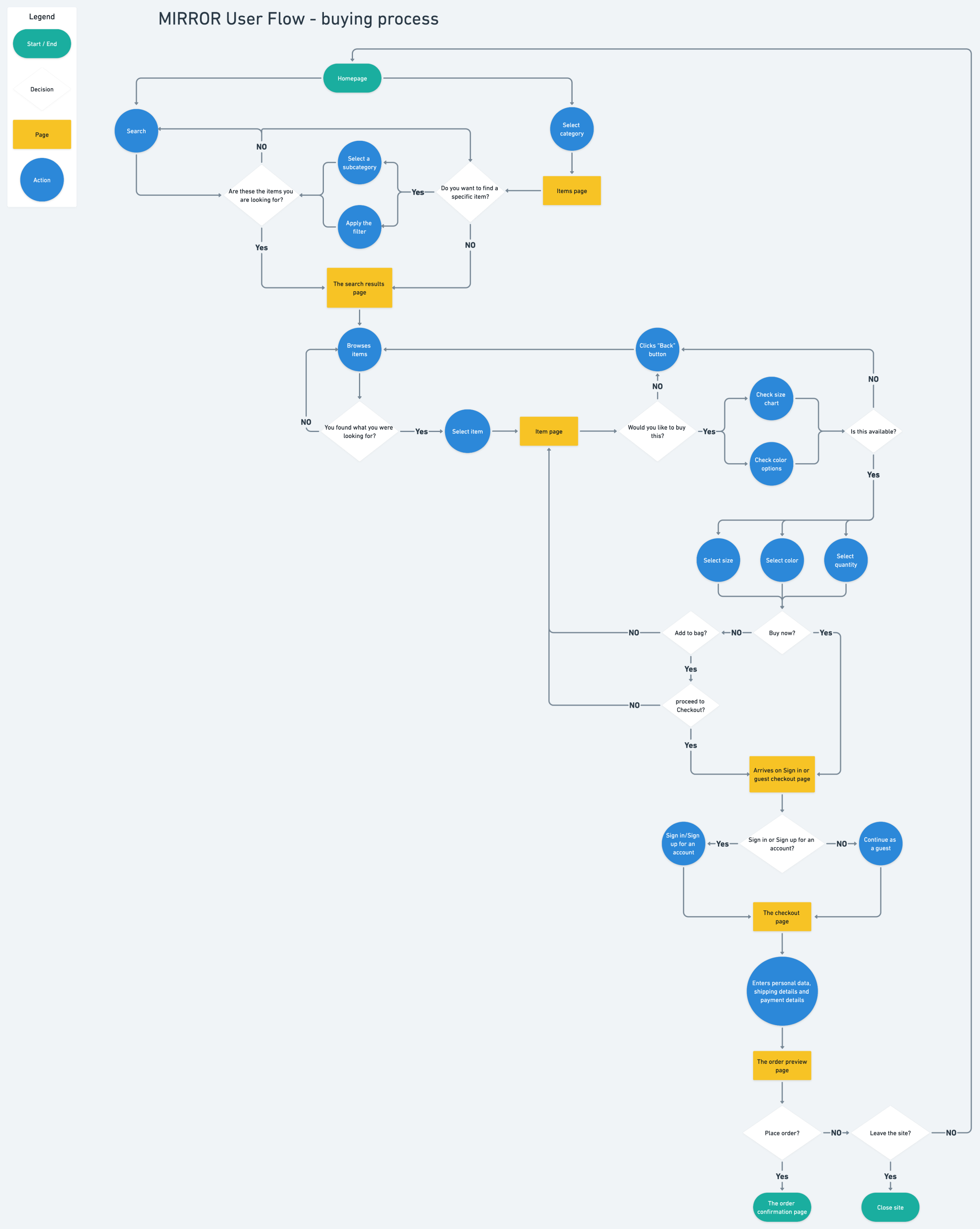
User flow
The next step is to create potential paths through a product. This helps me structure the various screens and features and how they relate to each other and minimise misunderstandings. I created a user flow for the buying process.
design
lo- fi Wireframes
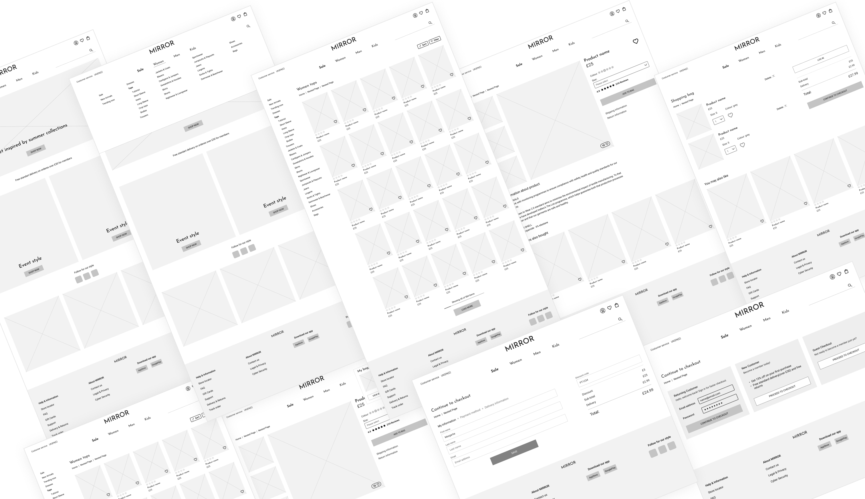
Hi-fi wireframes
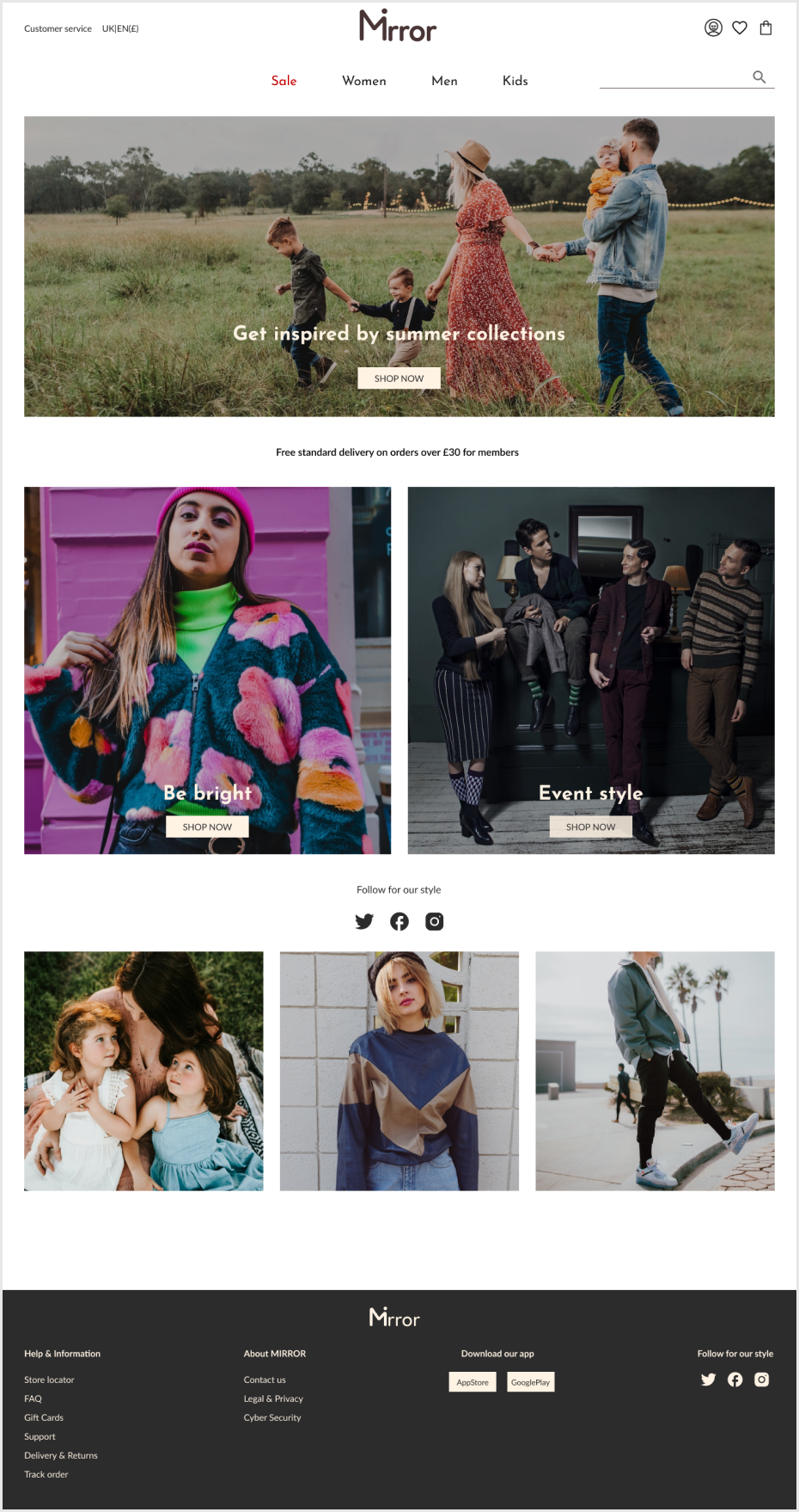
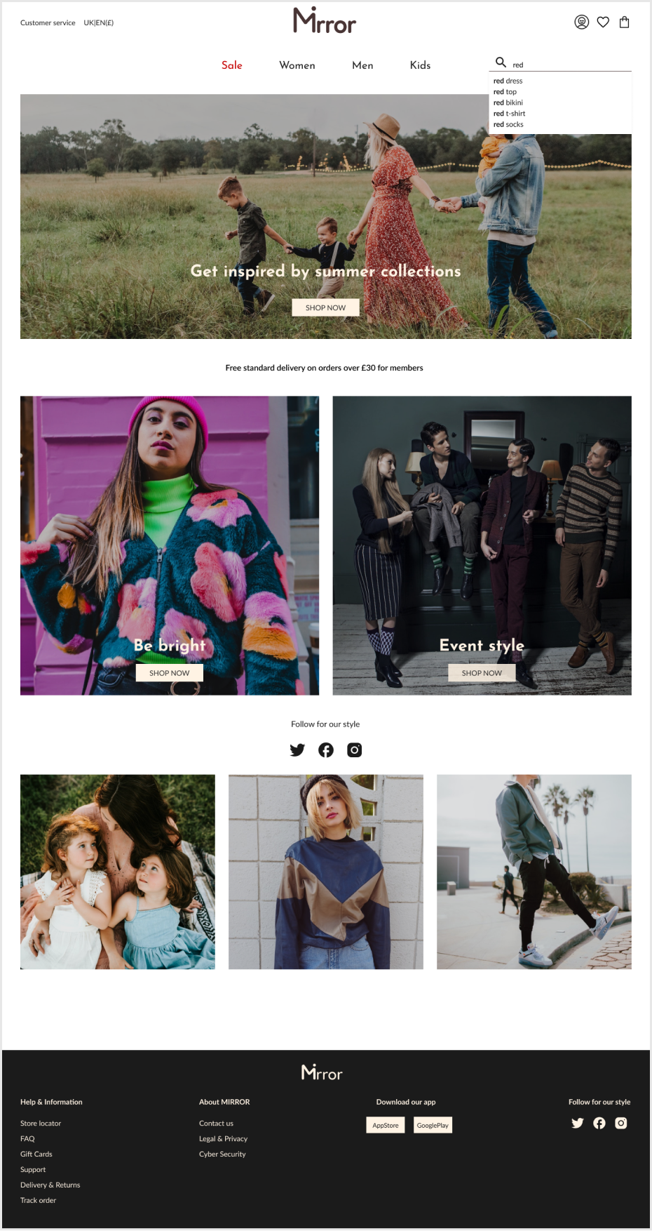
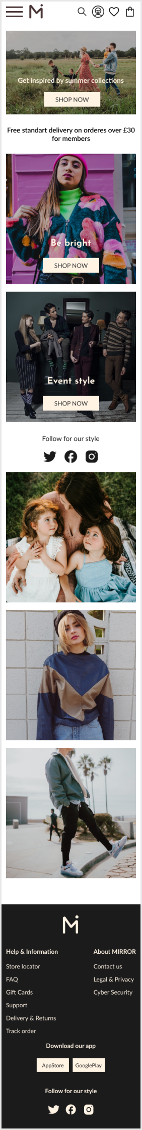
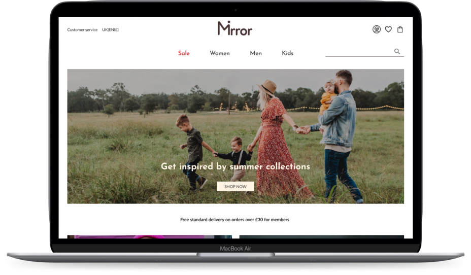
Homepage
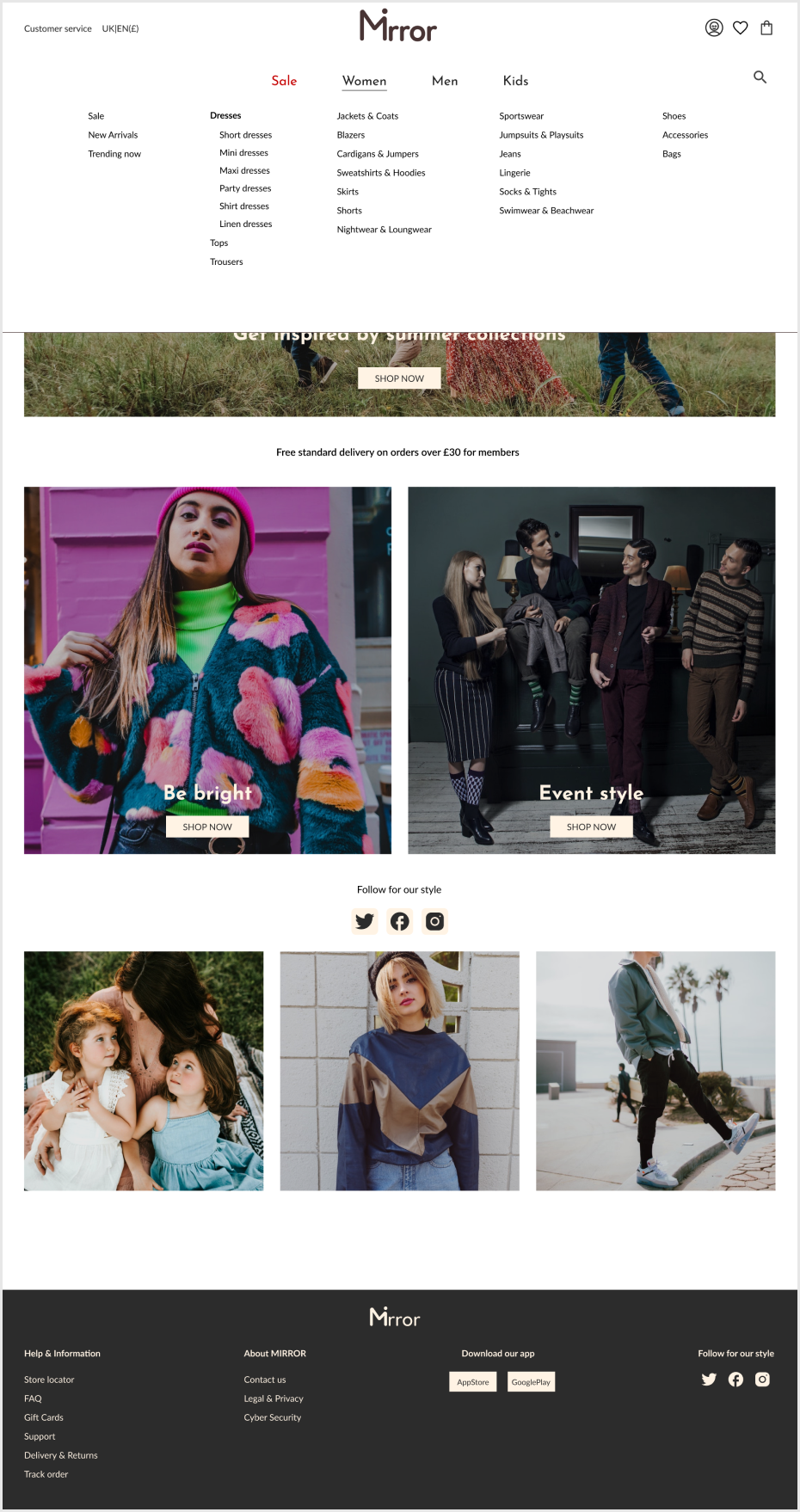
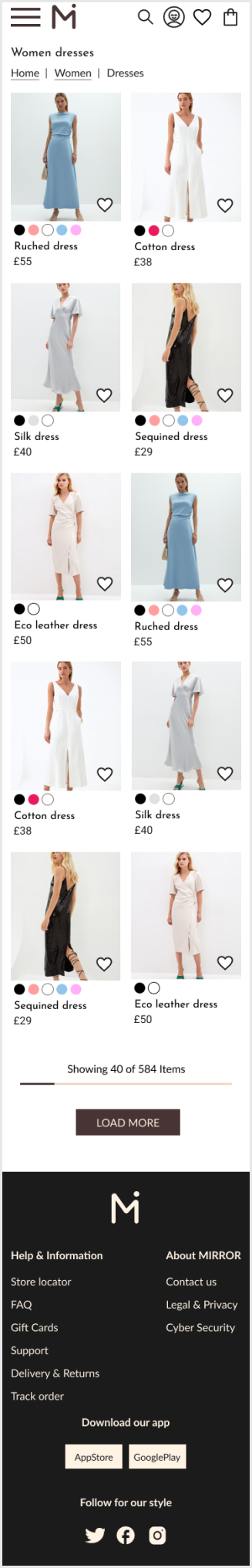
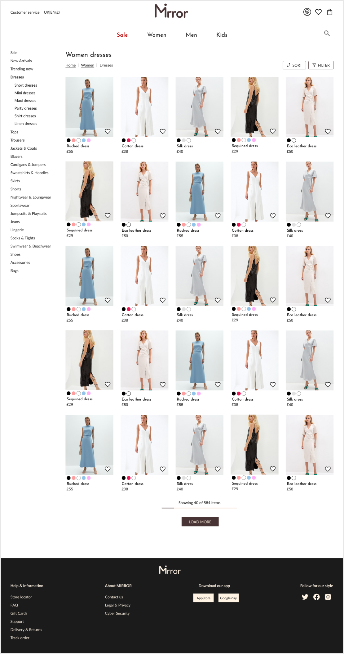
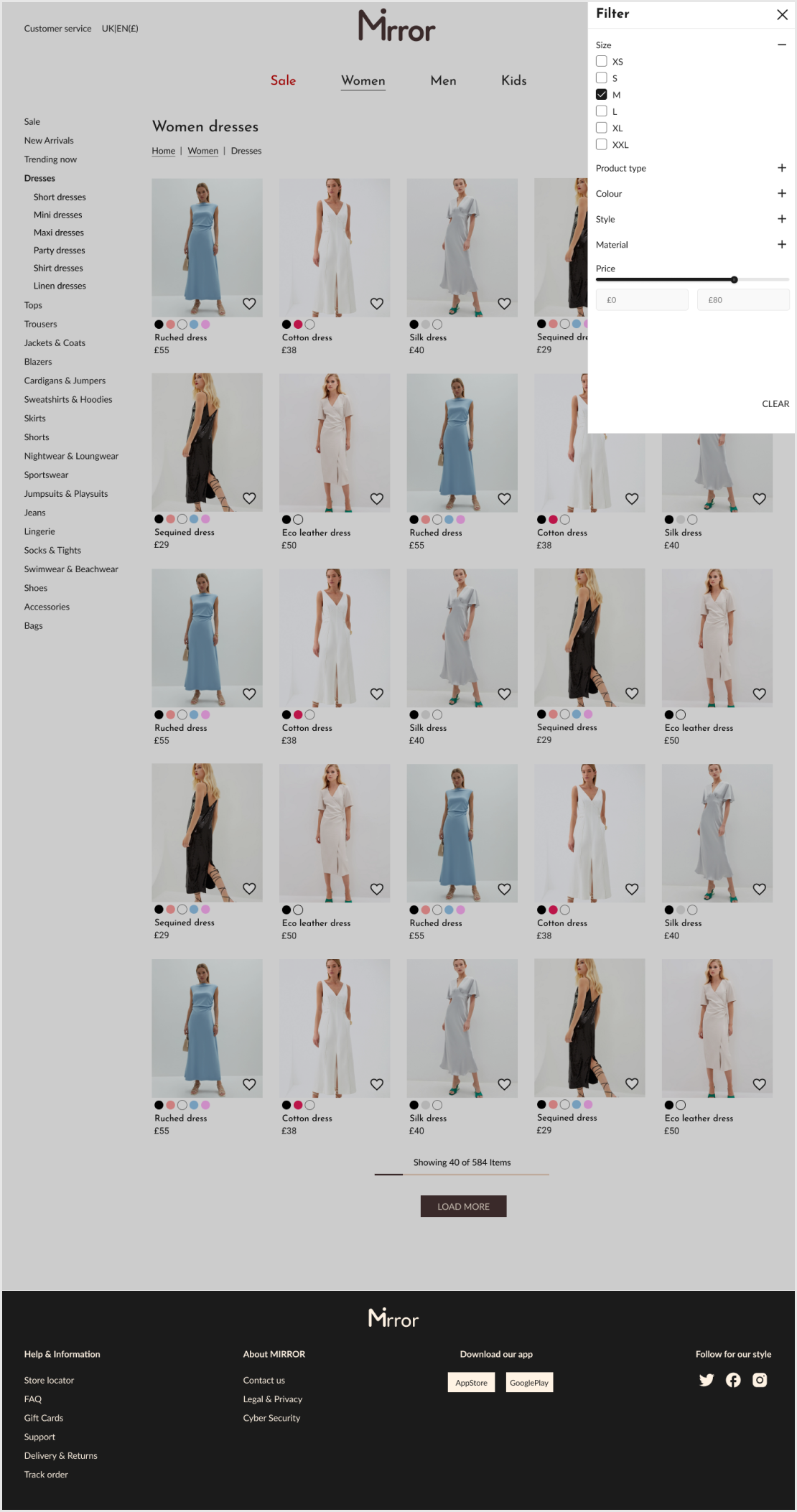
The products page
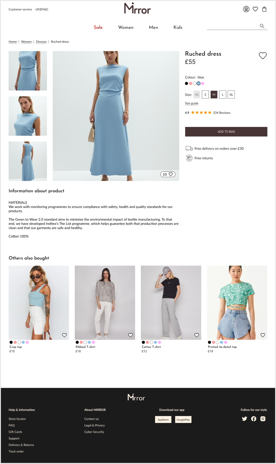
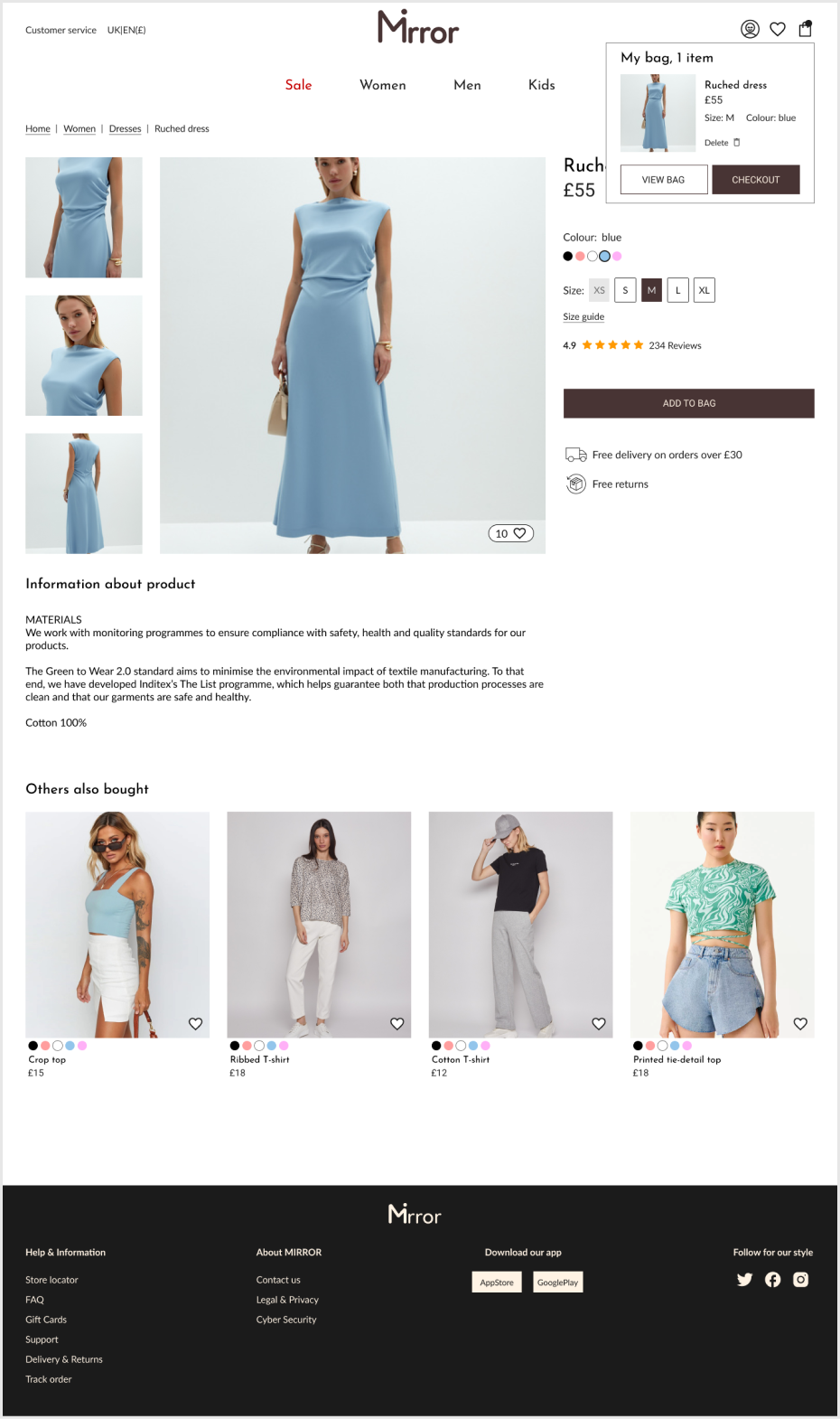
The product page & shopping bag
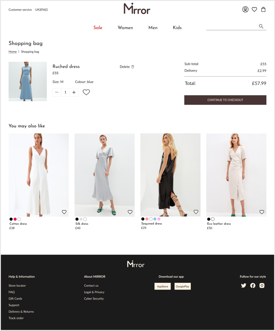
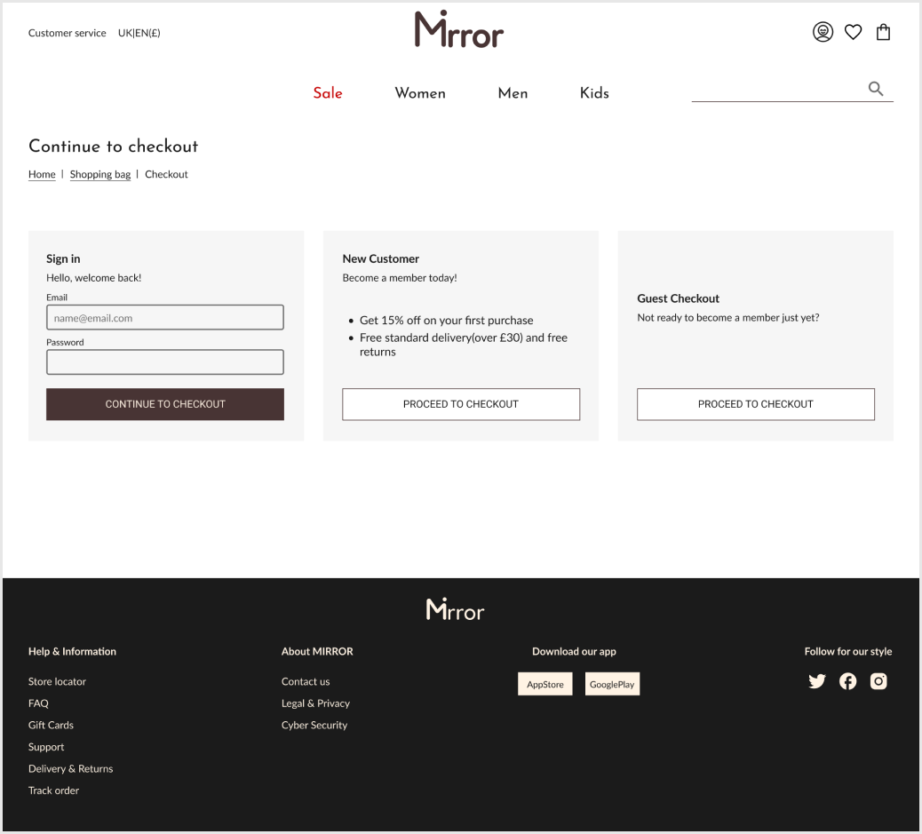
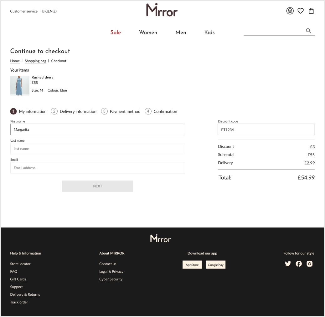
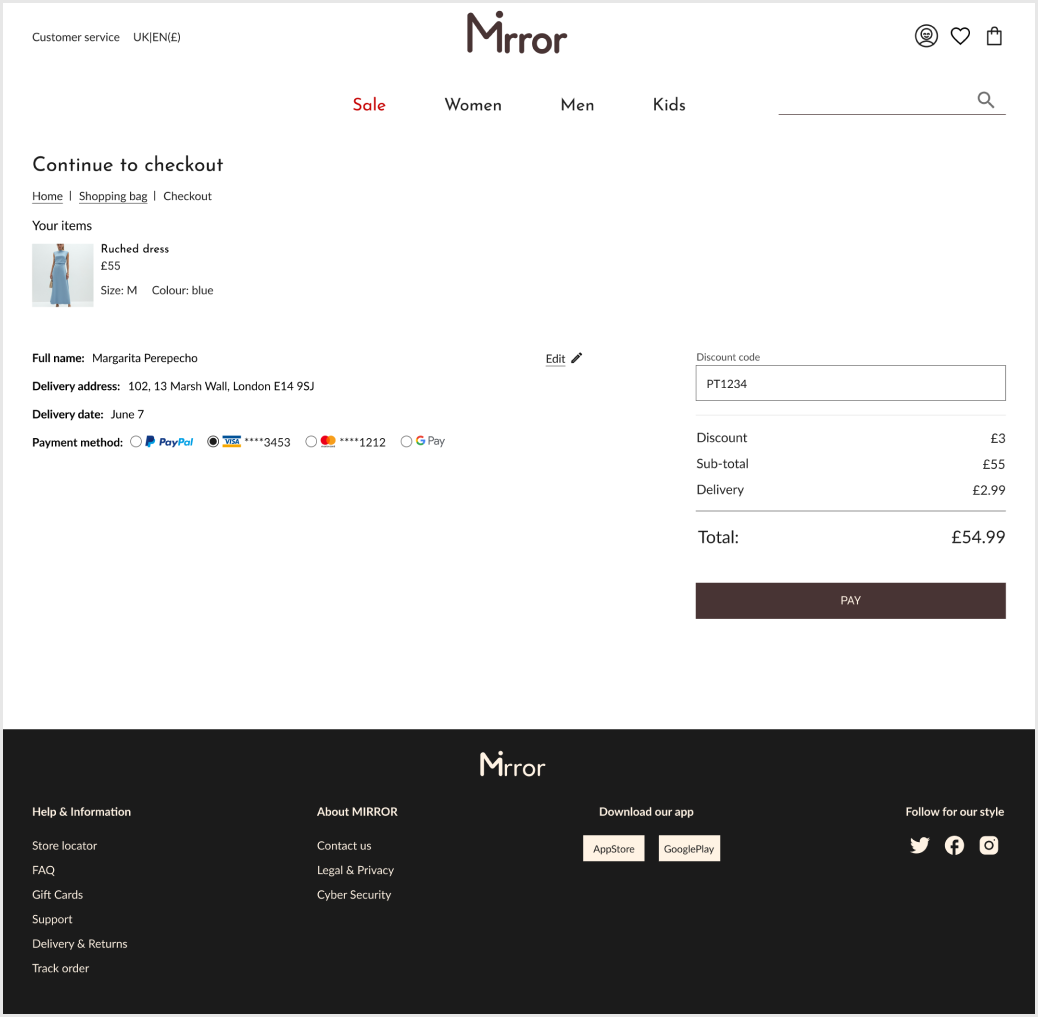
Checkout Process
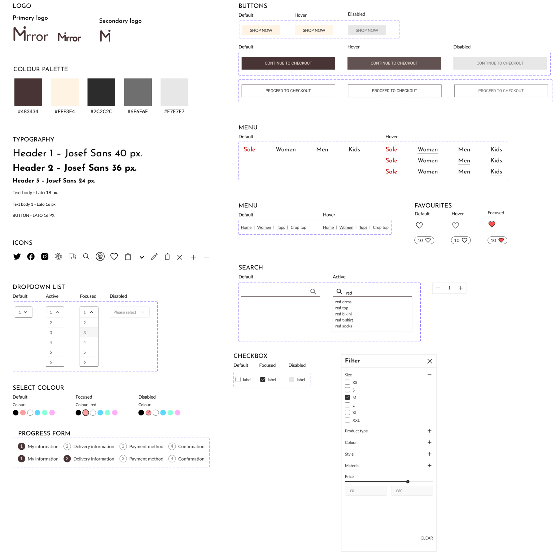
UI kit
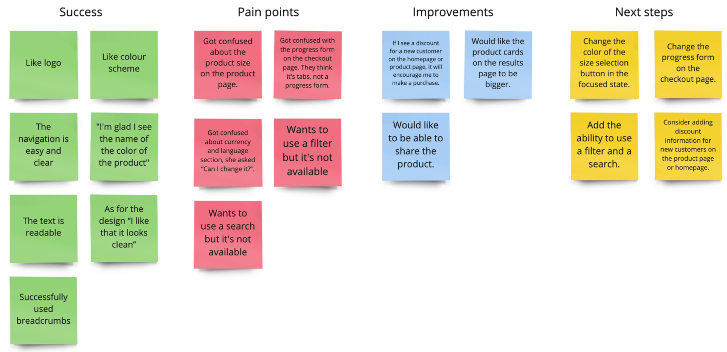
Test
Prototype
The participants had several tasks:
- Find a dress for the event;
- Add dress to cart;
- Continue checkout as a guest;
- Continue to checkout as a registered user.
Usabilty testing
Test Objectives
- Observe how participants complete the task.
- Observe participants react to the UI.
- Identify design issues that may be confusing.
Participant 1: 29 years old, often buys clothes online.
Participant 2: 54 years old, rarely buys clothes online.
Participant 3: 27 years old, often buys clothes online.
Participant 4: 33 pyears old, sometimes buys clothes online.