BE HEALTHY case study
A dashboard for doctors
Duration:
4 weeks (80 hours)
Role:
UX Researcher, UX/UI Designer

Project overview
"Be Healthy" is a dashboard for doctors, where they see their patients' records and give online consultations. It also helps improve communication between doctor and patient.
Problem statement
Doctors want to be able to give online consultations and write prescriptions in one place to save patients time. They also want to keep their patient's medical history in one place so that they can see the history every time and provide good treatment.
Solution
- Create a logo
- Create a responsive user-friendly design(focus on the doctor's profile)
project timeline
I only had 2 weeks (80 hours) for this project.

research phase
competitive analysis
I compared 3 services and checked the information about what they do and what features they have.

I also checked reviews about them and noticed the main issues that people faced:
- Sometimes patients can't make an appointment
- It is not possible to choose the same doctor
- Sometimes doctors can’t see the patient’s medical history
- No online support (if you have problems with the app/website, you need to call or email)
Insights:
- Ability to view the paitient’s medical history
- Get notification of new or canceled meetings
- If the patient has technical problems with the video call, be able to call the patient on the phone
- Ability to share prescriptions in the app and via email
- Ability to schedule an appointment
User interview
My next step was to create open-ended user interview questions. I had 2 types of users: a doctor - to have an idea of how the working day goes; the patient - to have an idea of how he makes an appointment, how the appointment with the doctor goes during and after.
Insights:
- Wants to see the patient’s medical history and documents before and during the appointment;
- Wants to be notified of new or canceled meetings and see them on the home page;
- If a patient or a doctor has technical problems with the video call, be able to call the patient by phone;
- Wants to take notes during the appointment with a patient;
- Wants to have an easy way to create prescriptions and share them with the patient.
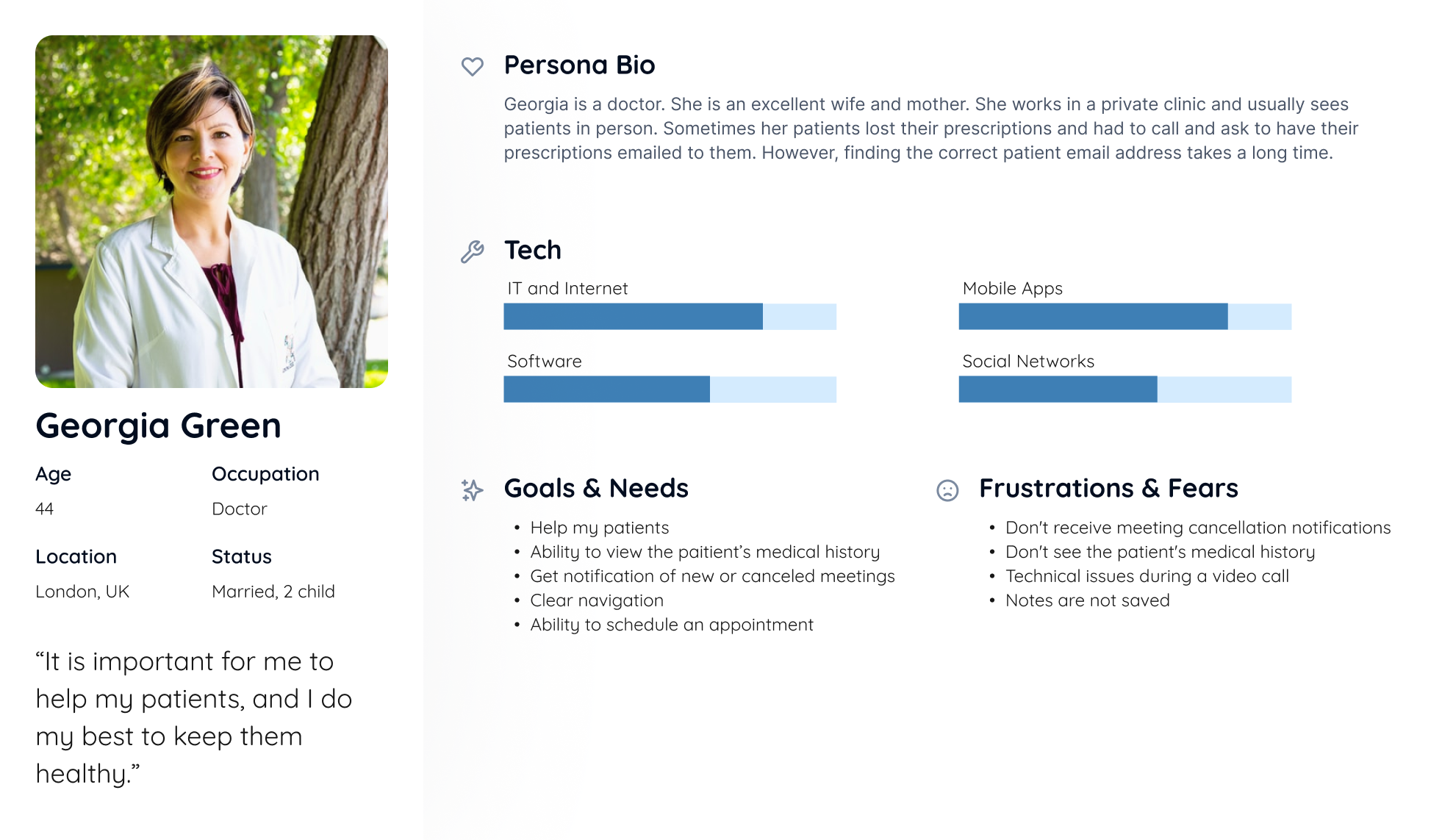
User Persona
Based on the responses I received from the user interviews, I created the following user persona. Meet Georgia. She is a doctor and target user.
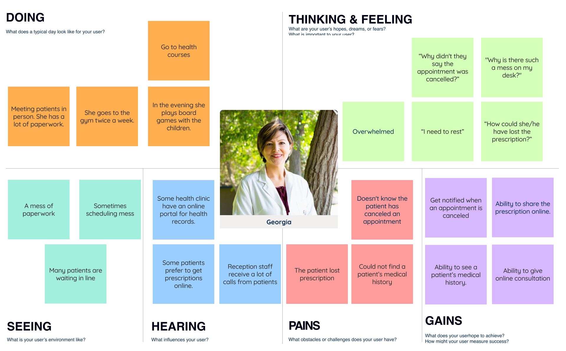
empathy map
Based on the responses I received from user interviews and user persona, I created an empathy map that allowed me to identify the real needs of users and their expectations, rather than my assumptions.
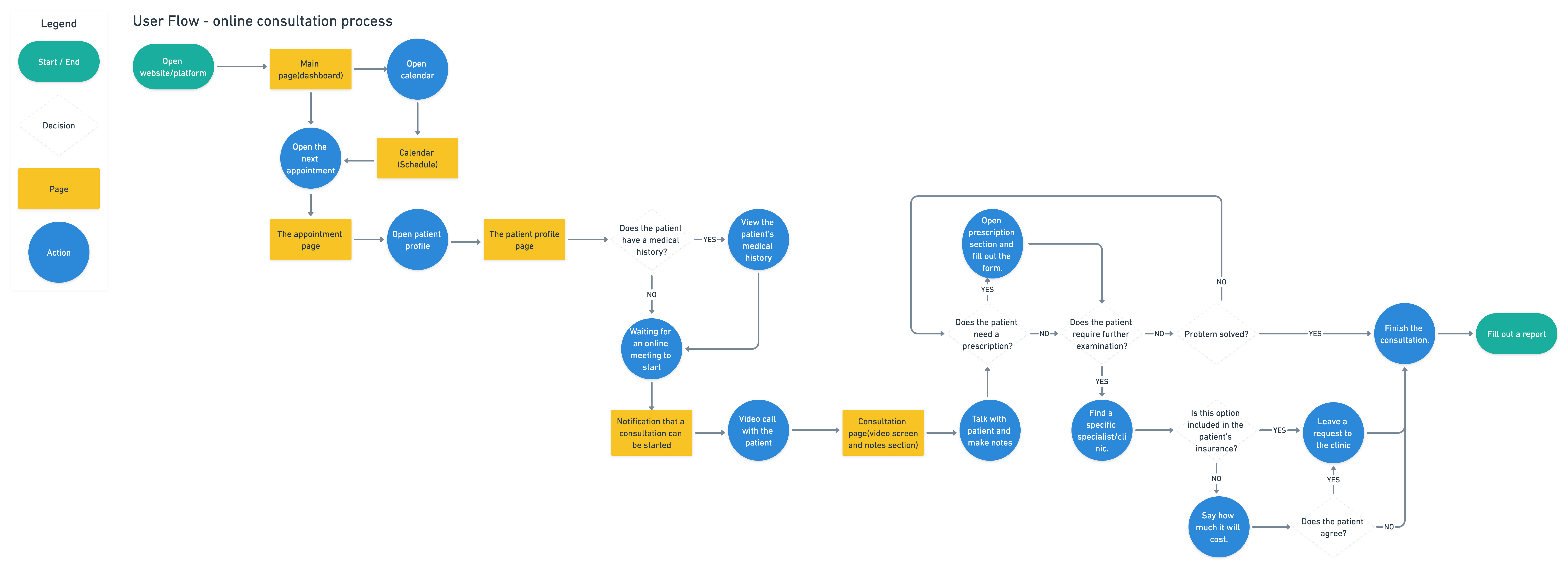
user flow
The next step is to map out the structure of the dashboard and show the path the user takes when using it. The user flow helps me structure the various screens and features and how they relate to each other and minimise misunderstandings. I created a User Flow - an online consultation process from a doctor's point of view
Design phase
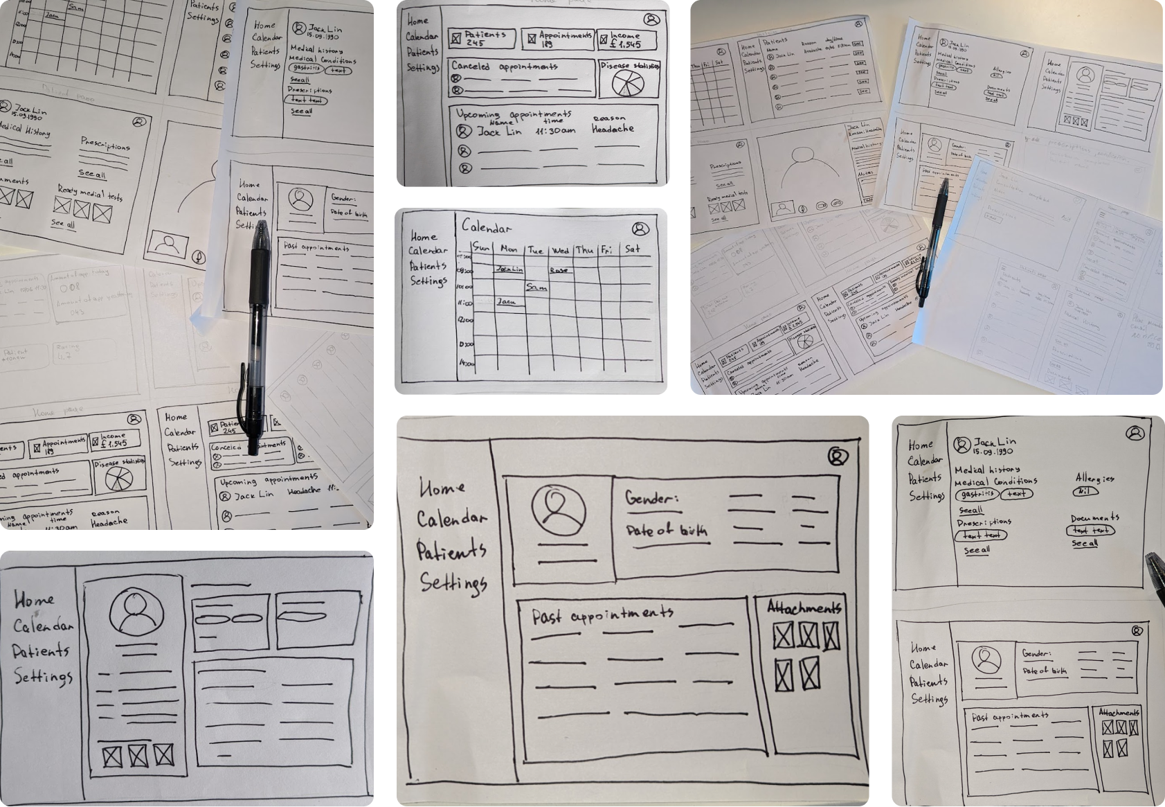
Paper sketches
Before starting the process of creating the hi-fi frame, I started by sketching out some freehand ideas. This helped me narrow down the areas I wanted to focus on.
Wireframes
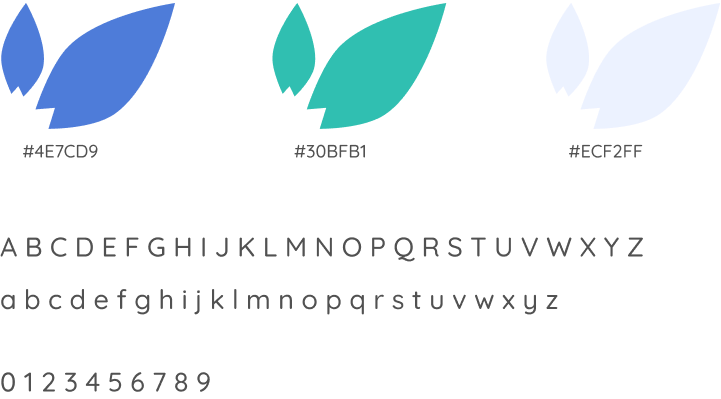
Colour & typography
Usability study
Partisipants:
2 participants aged 23-55 who frequently use telemedicine.
1 participant is a massage therapist(works in a private clinic).
Test Objectives
- Observe how participants complete the task
- Observe to the difficulties that the user encounters when working with the interface
Insights:
- Remove disabled buttons on the home page;
- Add an attachments section to the notes section(each note has its own attachments);
- Add a label "follow-up" appointments;
- Add the ability to filter by medical condition in the section of past appointments(patient profile);
- Add the ability to cancel an appointment in the calendar;
- Add the ability to make a diagnosis on the video call page;
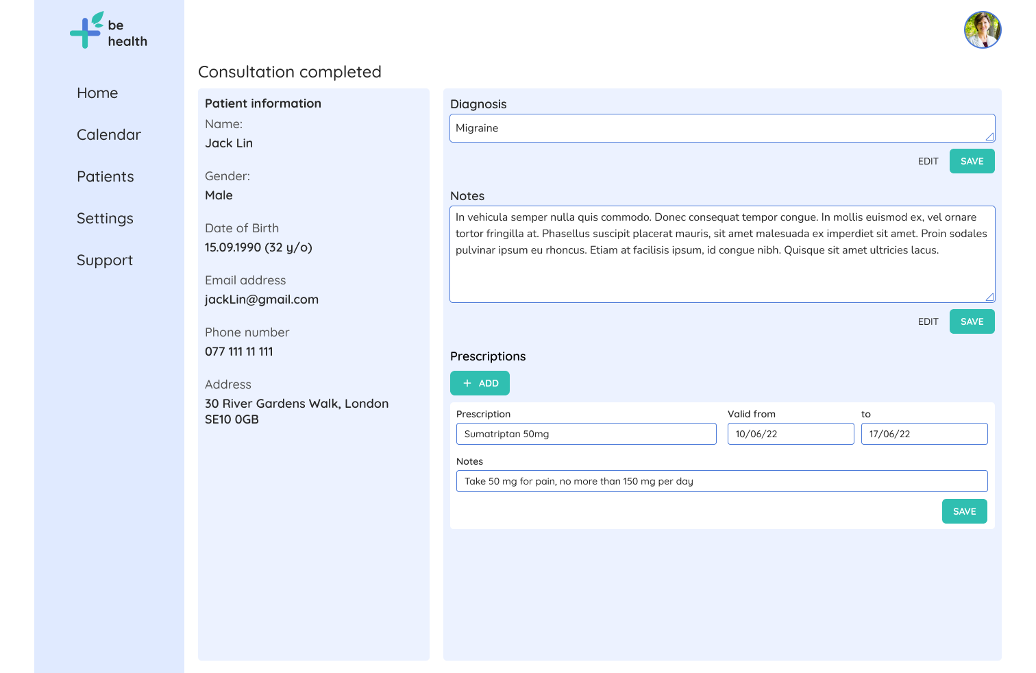
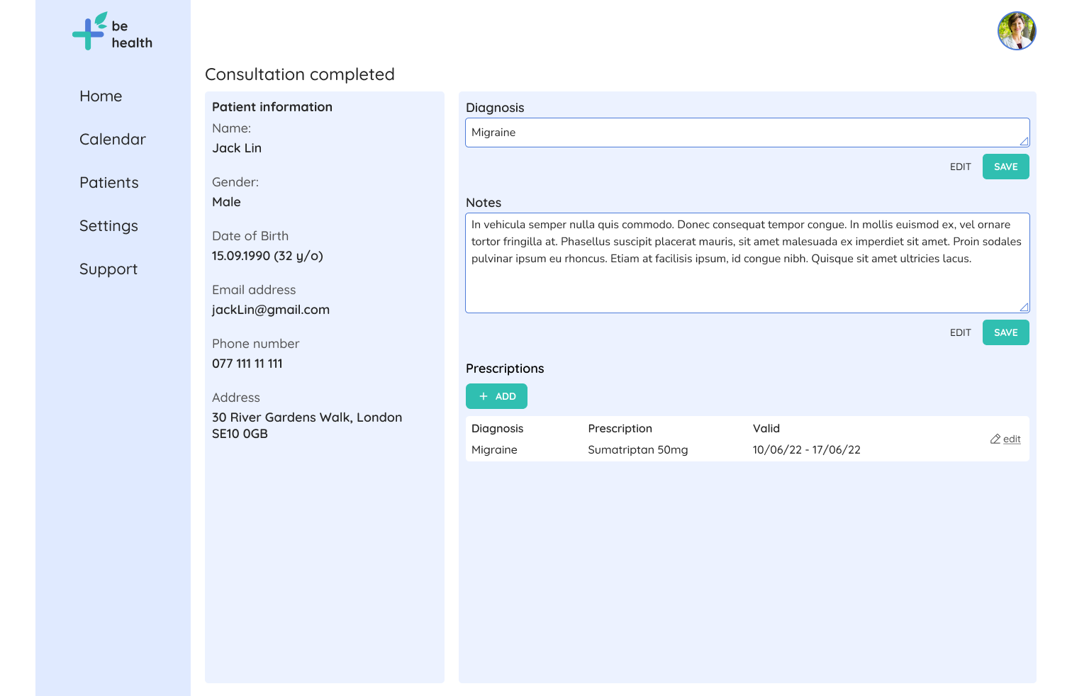
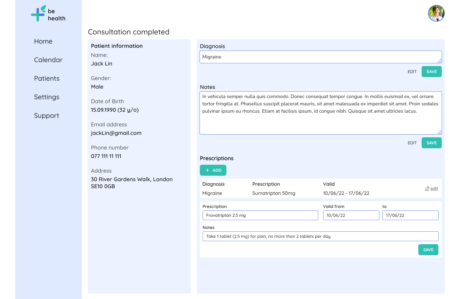
- Add the ability to add multiple prescriptions;
- Add a “how to take medicines” section to the prescription section.
Hi-fi wireframes

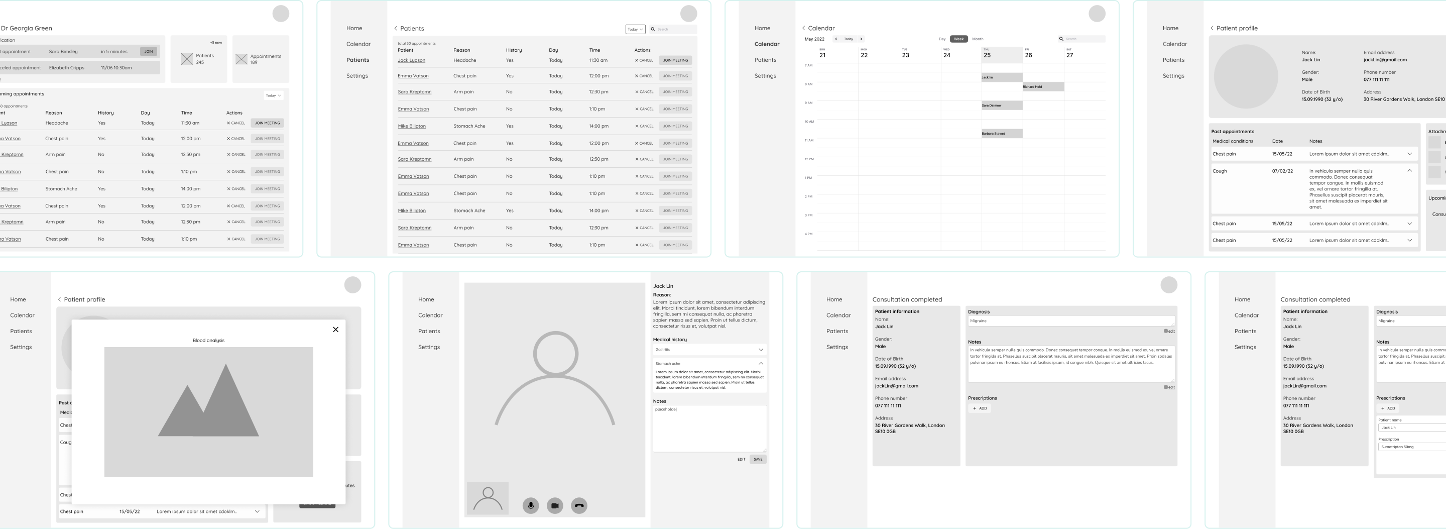
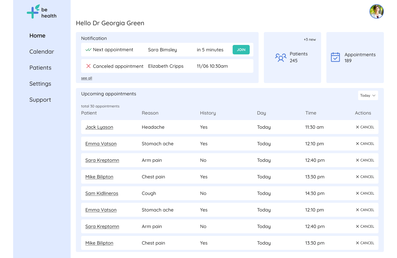
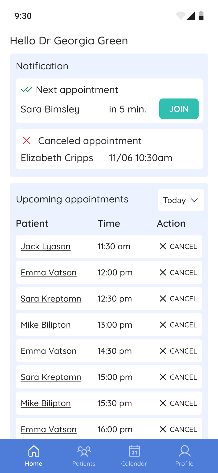
The homepage
- Receive and see notifications of canceled and upcoming appointment
- Ability to see all upcoming appointment
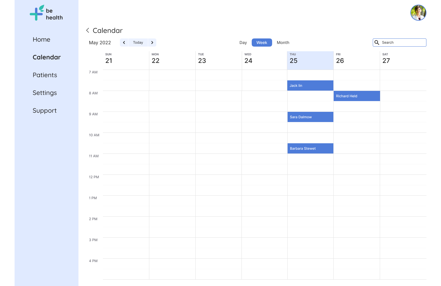
The Calendar
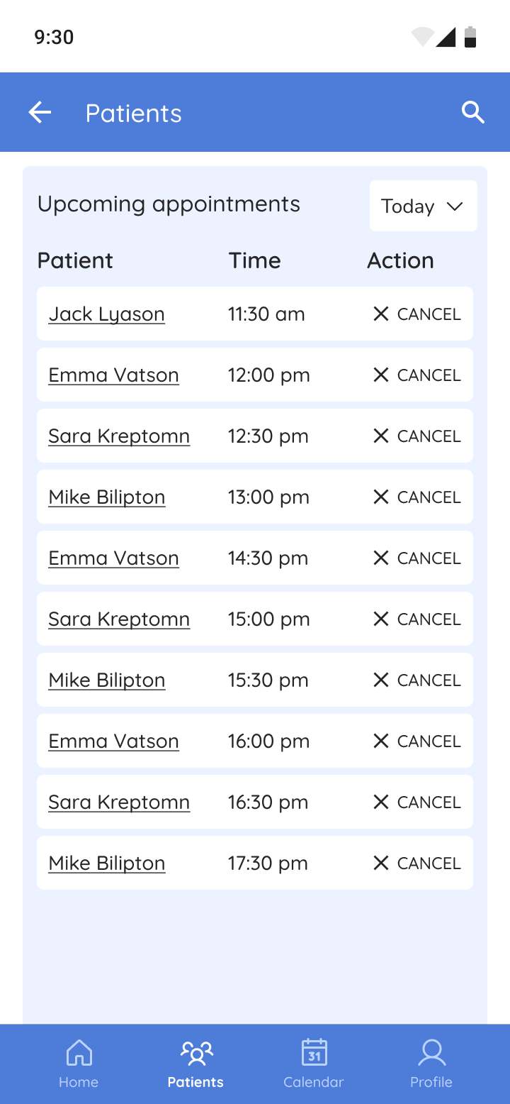
The patient list
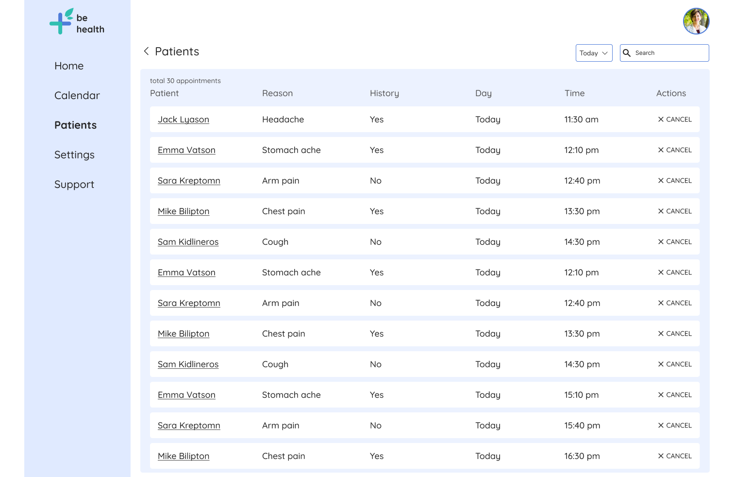
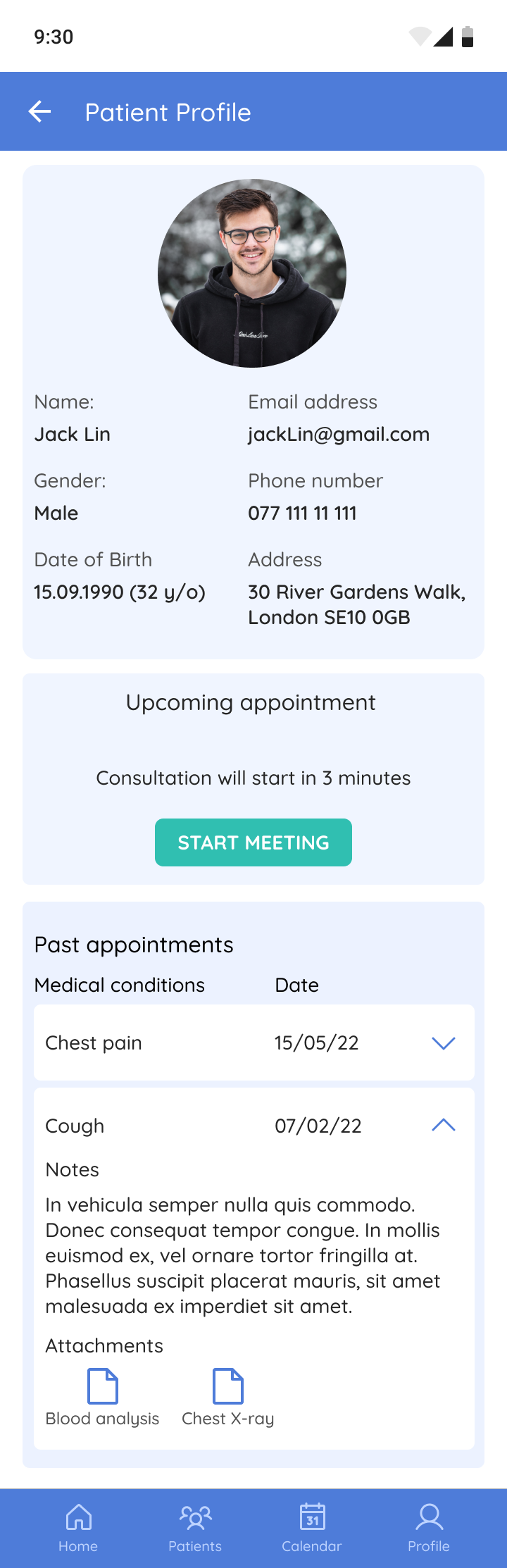
The patient page
- Ability to view the patient's medical history
- Quick way to start a meeting
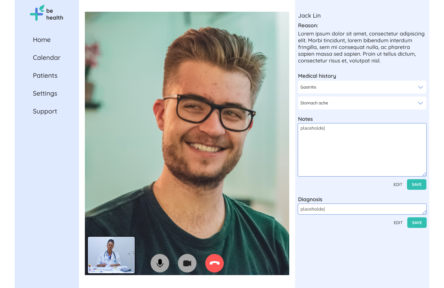
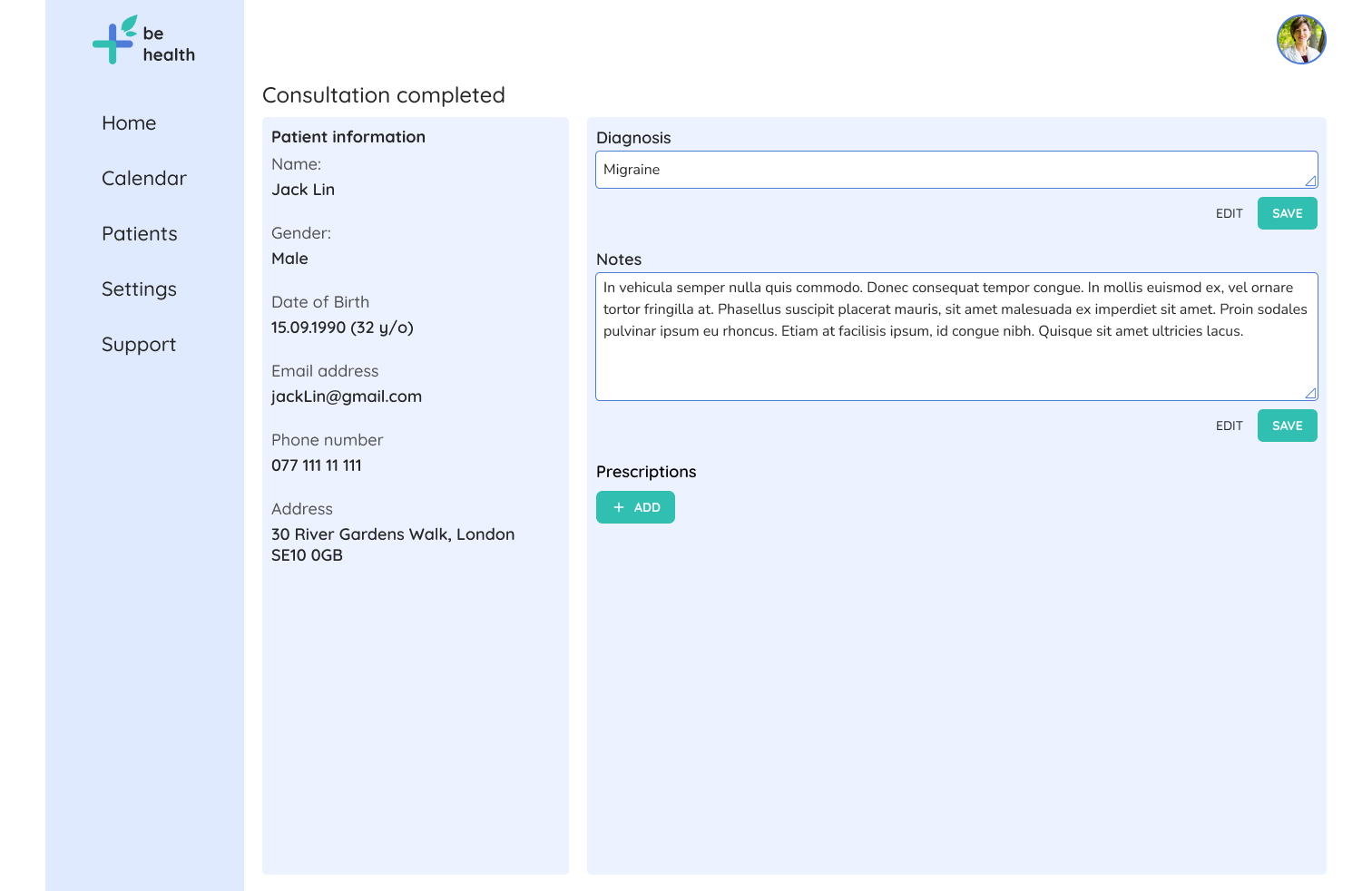
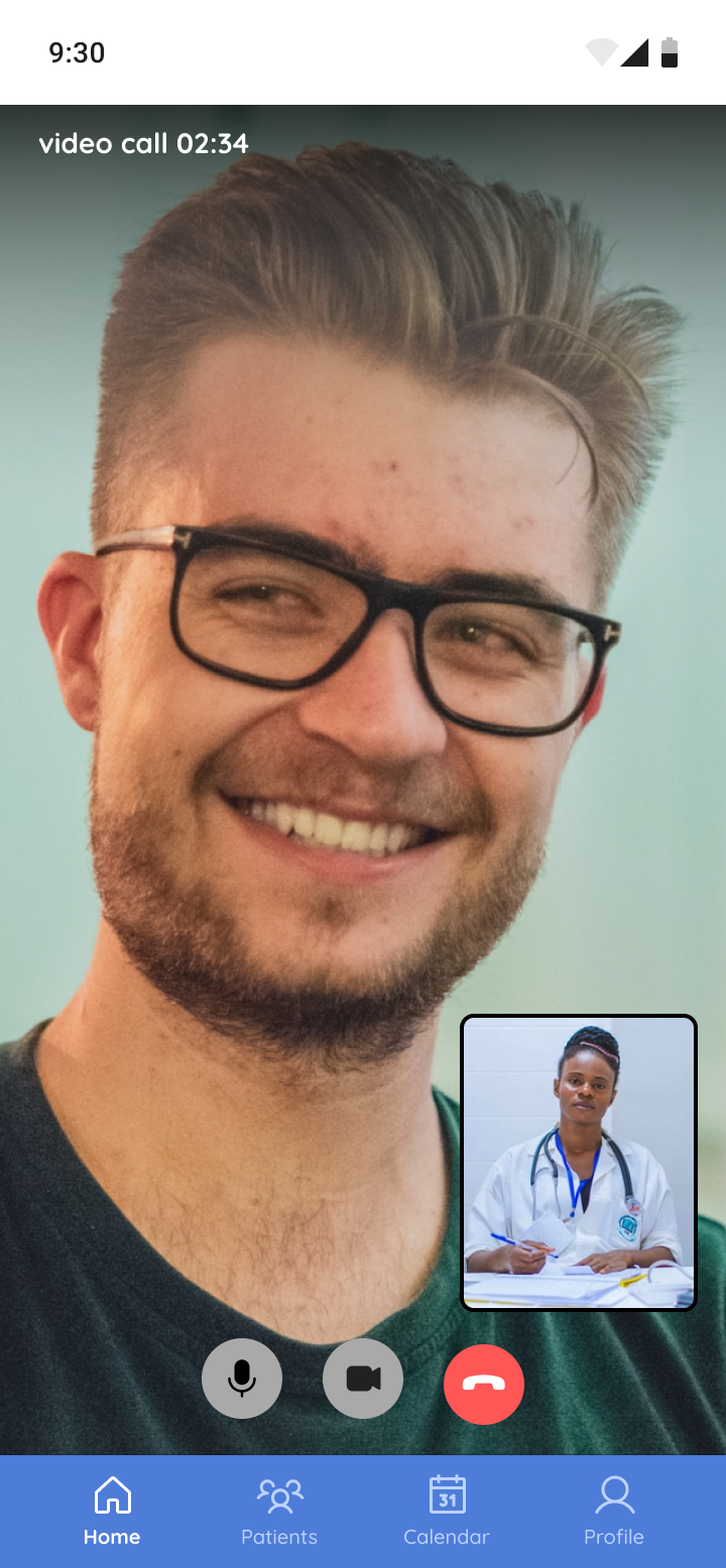
Online consultation
- See the patient's medical history
- Take a notes
- Make a diagnosis
Other Screens
Next steps
I only had 80 hours for this project and if I have more time my next steps will include:
- Another round of usability testing - I need to make sure the navigation and design is understandable to users before handing it off to developers
- Further changes and interactions based on testing
- Transfer of design to developers